
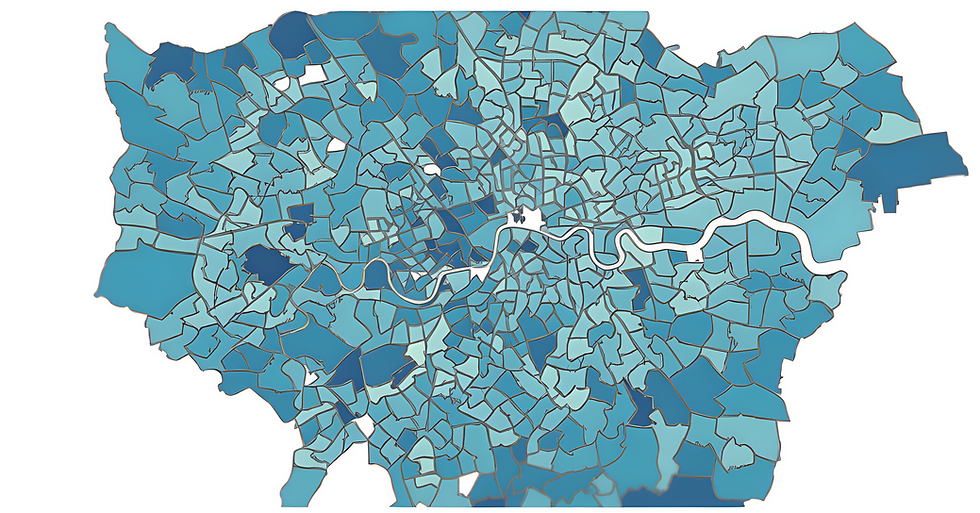
Data on how pupils are travelling to school in London can be incredibly useful for campaigning, but hard to come by! So, we modelled pupil travel for all London primary schools. Check out your local school, get the insights for your borough or take a look at city-wide trends. It’s all there!
About the dashboard
The average driving rate for a London primary pupil travelling under 1 mile to school is 7%, that increases to 65% for distances of 1-2 miles [National Travel Survey]; the distance pupils have to travel to school is a huge determinant of how they travel.
So, we applied these London driving rates to actual London primary pupil travel distances. The dashboard panels enable you to better understand school run travel for primary schools, and work out which school trips are most likely to be made sustainably and which are likely to be driven.
You can take a look from a city-wide view, or break it down to Inner or Outer London, borough, ward, school type and school.
These insights can help us better understand how many primary pupils are already travelling sustainably, which justifies the need for safe and healthy streets. Additionally, it can help to identify the areas and trip lengths generating the most school run driving, which can inform solutions.
London key findings
Across London level our data modelling shows that:
75% of primary pupils are walking and cycling to school, which is 600,000 pupils.
25% of London primary pupils, which is 200,000 pupils are driven to school and we estimate these journeys make up 480,000 car trips per day.
School run car use is most prevalent in the distance range of 1-2 miles to school.
Check out more insights on the London school run in our key findings.
Also see - you can read our Key London Findings in full on our page here. (coming soon)
Using your local data to boost your safer streets for kids campaigns.
Parents - use the data insights to make your community campaigns stronger, clearer and more persuasive. Check out use cases here (coming soon).
Council officers and ward councillors - use the data insights to justify your school street or safer street programs. Check out our use cases here (coming soon).
User tips
On each panel, you can use the filters to select a school, school type, ward or borough of interest. This will update the analysis on the panel for that selection. You don't have to select every filter, you can jump straight to the filter of interest E.g. if you want to select a school you can just go to the school filter, you don't have to first select all the other filters first. For help understanding what the analysis on each panel displays, you can refer to our User Guide.
Methodology
The data model calculates pupil travel distances using 2022 pupil catchment information and then estimates a model of travel for each distance band using London averages from the National Travel Survey.
Since the mode of travel is modelled using London averages, this method will not account for factors such as car ownership, public transport, school culture which will in reality affect the driving rates for each borough/school. Full details can be found on the methodology page here (coming soon).